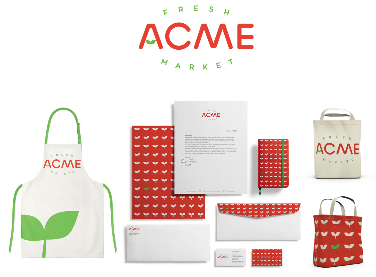
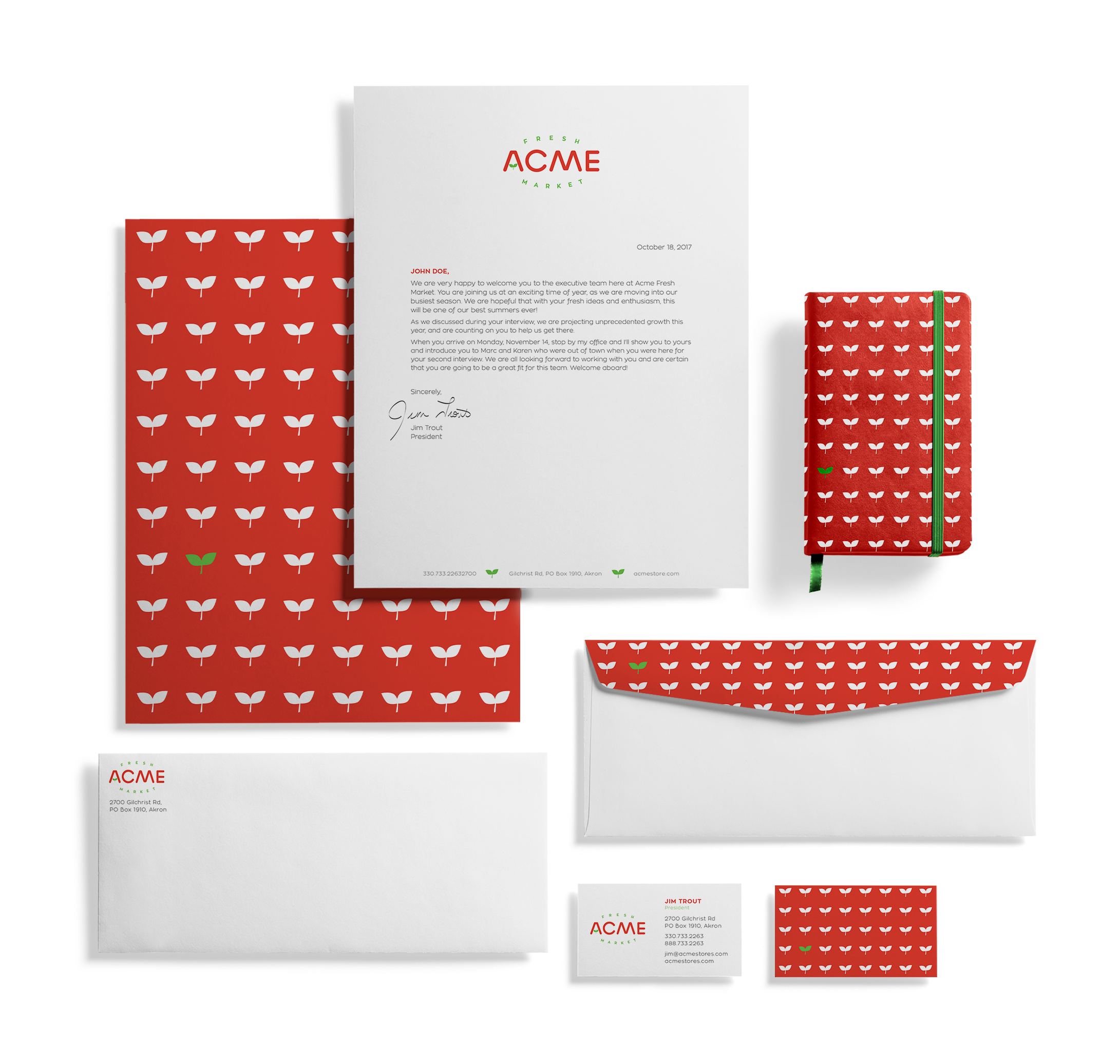
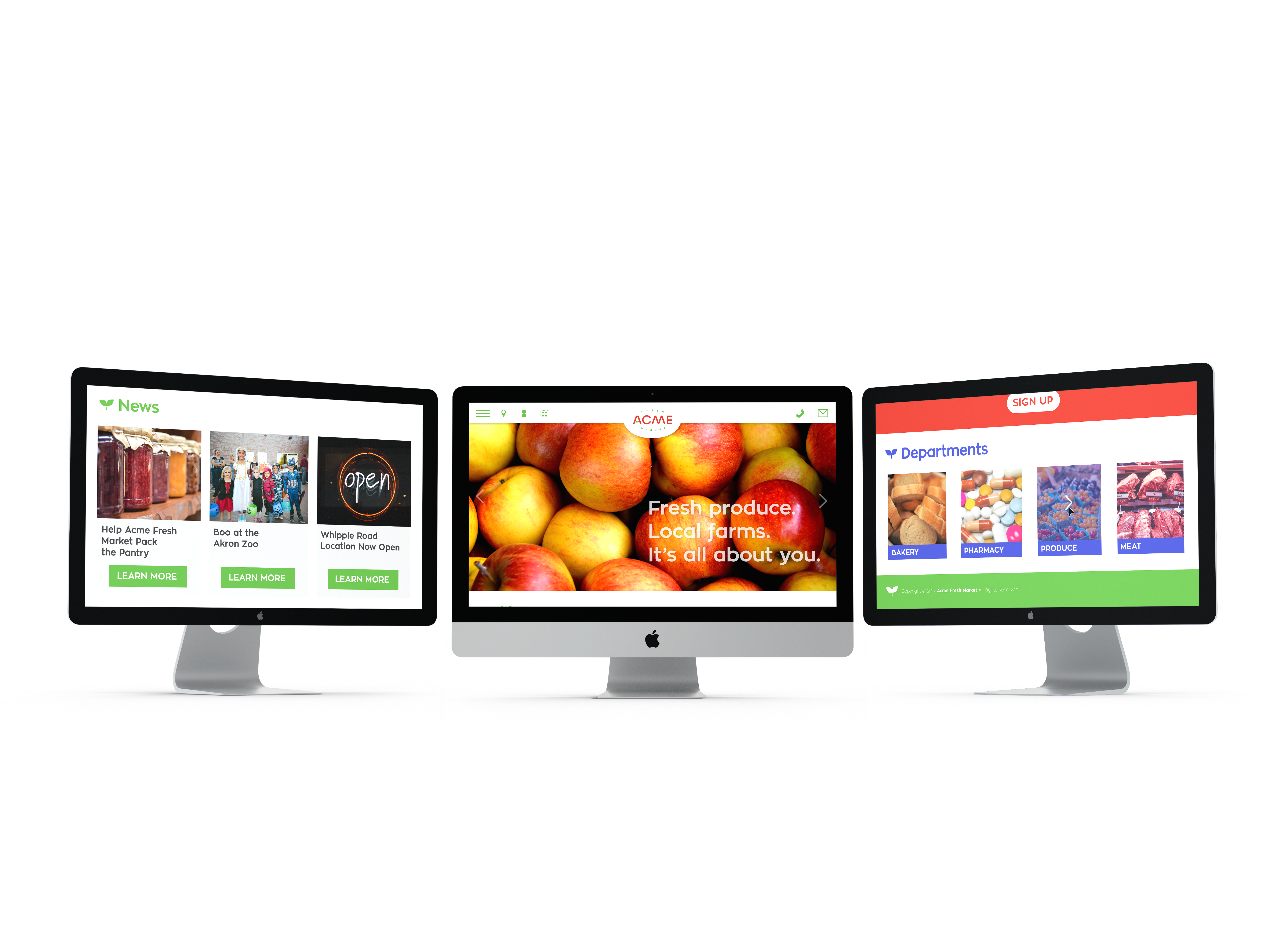
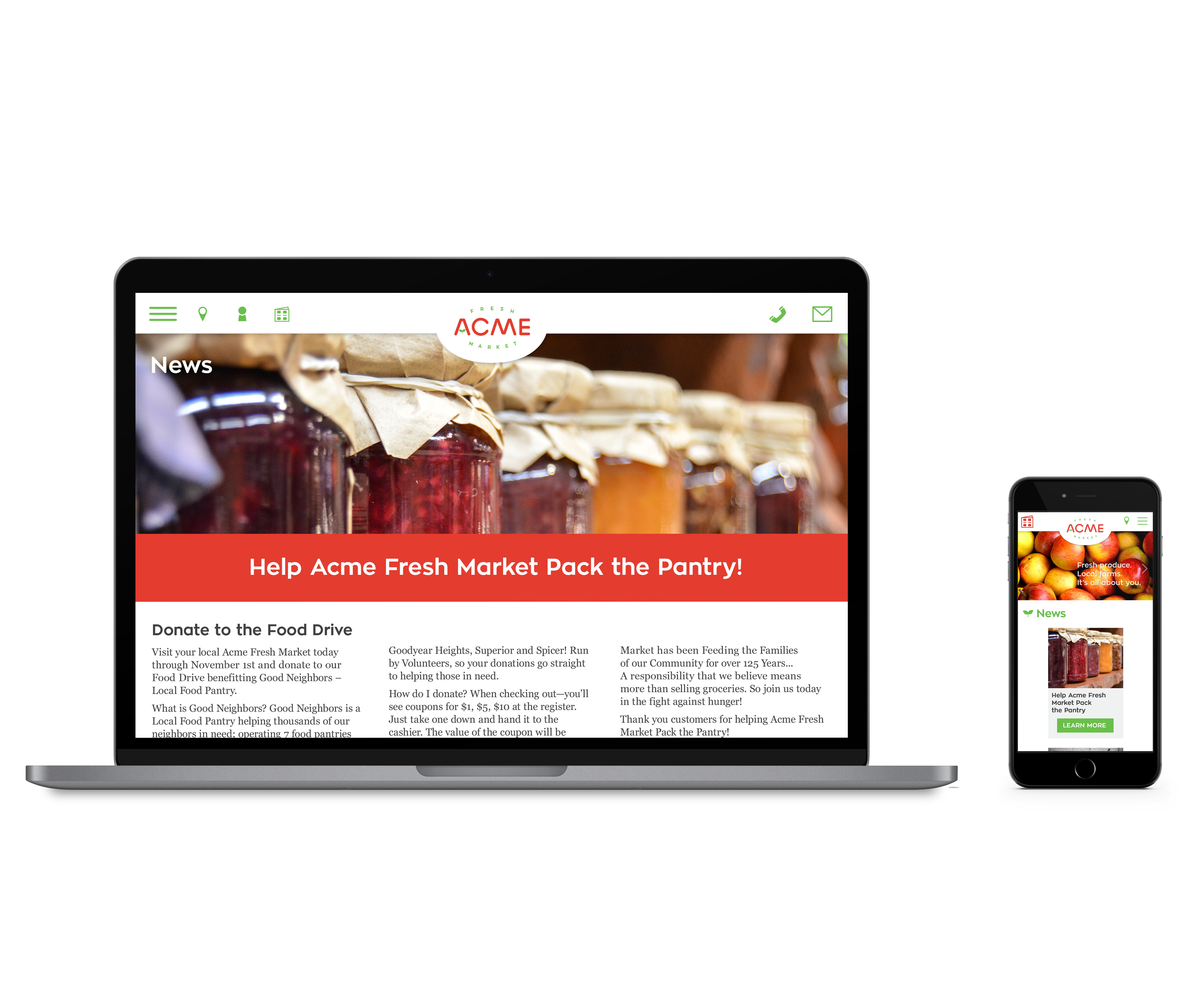
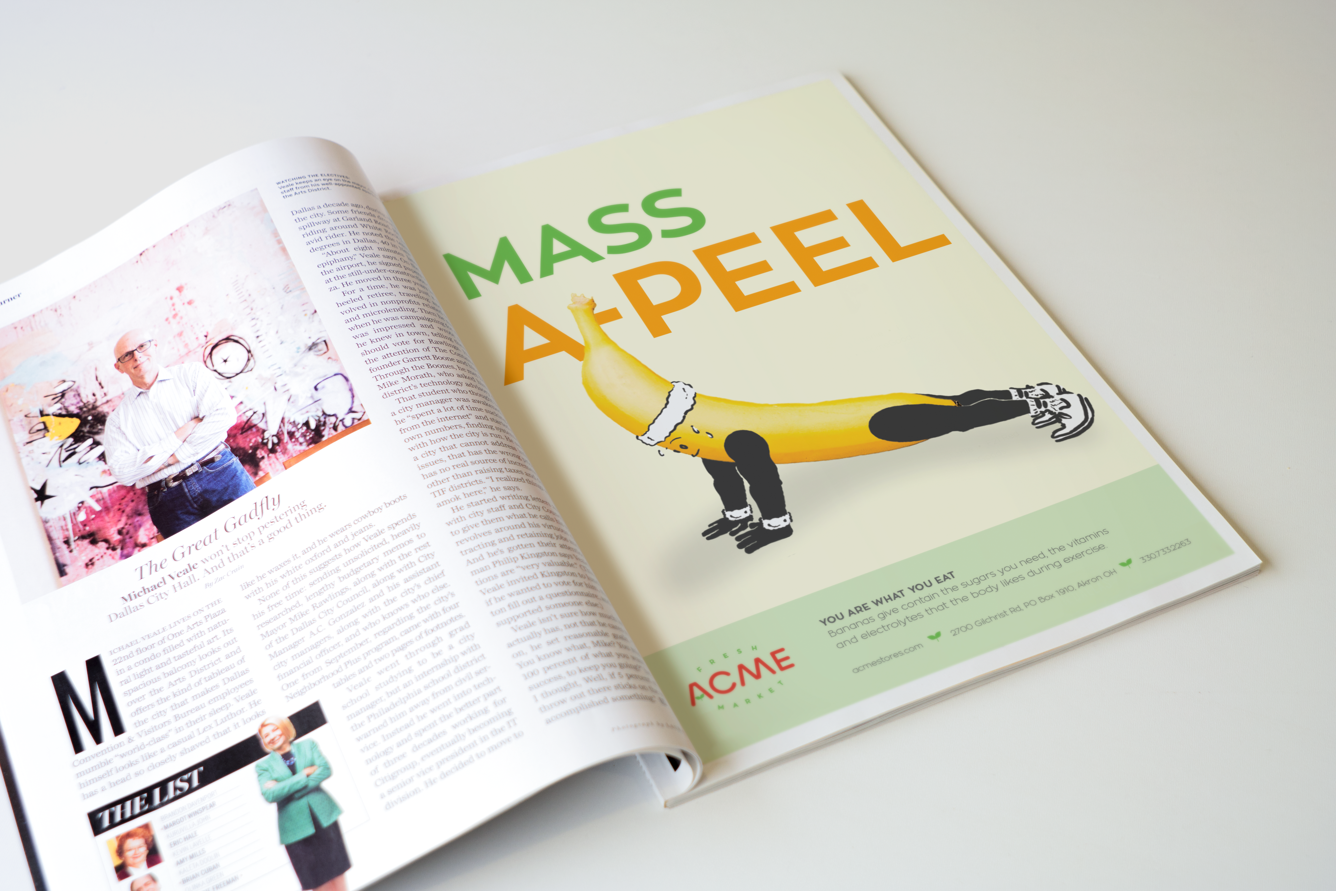
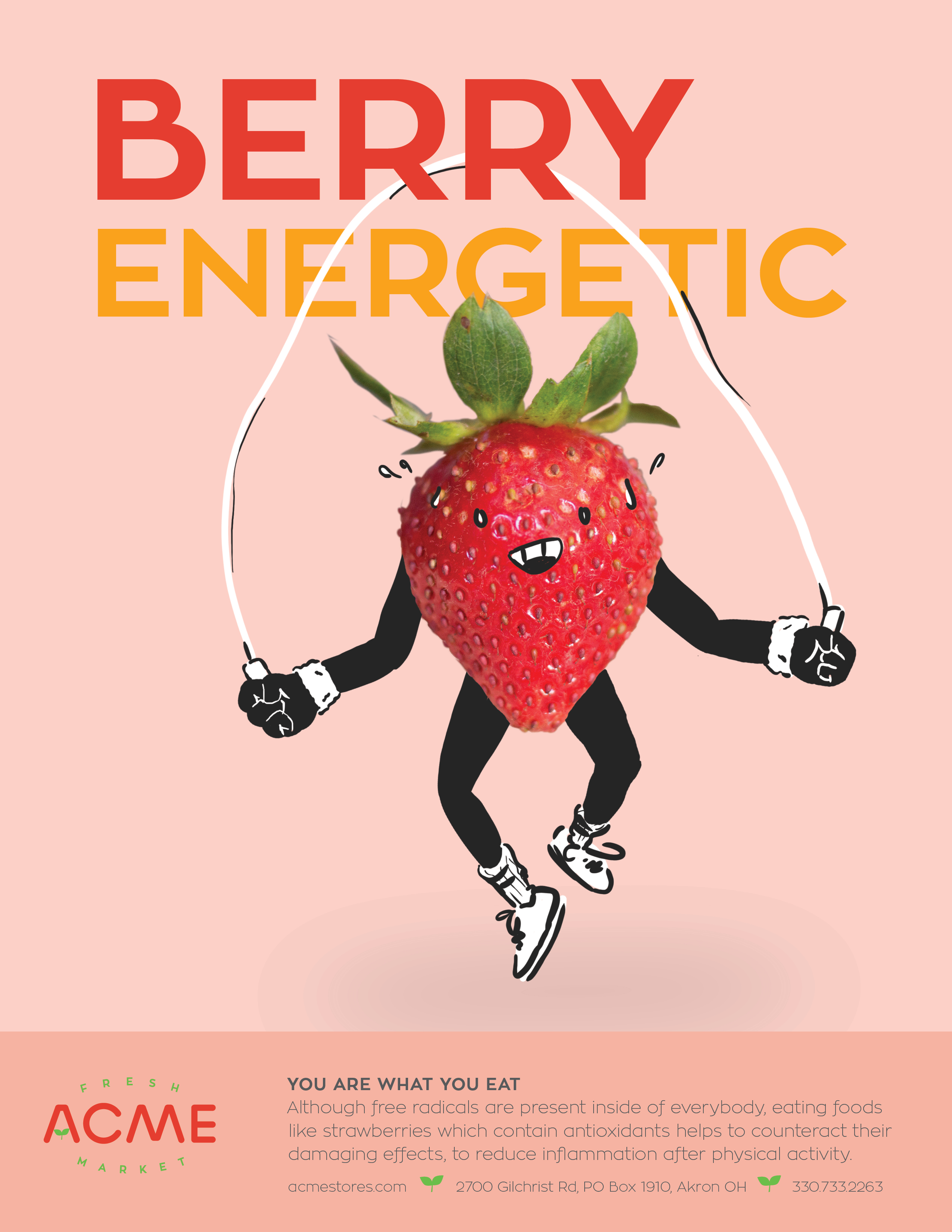
The approach for this re-branding of Acme Fresh Market was to update the brand and give it a friendly, modern look to attract a broader range of customer. The brighter colors are used to invoke fresh, appealing provide the custom “Acme” word mark has a rounded sans serif to have a friendlier appearance along with the bright colors.